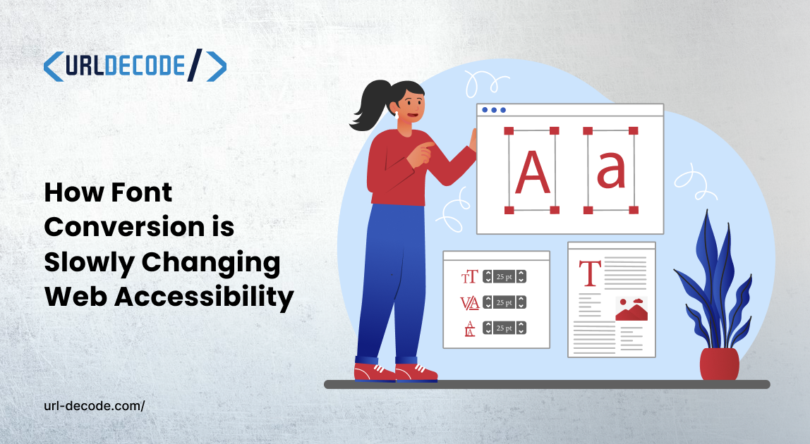
How Font Conversion is Slowly Changing Web Accessibility
Every day, the fonts we use to read emails, browse websites, scroll through social media, and take in digital content shape how we read. Most people do not think about what's happening behind the scenes. How does a font made on one system look good on another system? How do you turn text into fancy letters for an Instagram bio?. How can changing a font make the internet easier for millions of people who have trouble reading?
Font conversion is the answer to all three of these questions.
What This Really Means
It seems easy to convert fonts. Depending on the situation, it can mean two different things.
The technical part is about file types. Fonts are stored in files called TTF, OTF, WOFF, and WOFF2. Each one of these files works depending on the browser, operating system, or device. If the format is not right, a typeface that looks great in a desktop design tool might not show up on someones phone. Changing between these file types makes sure font conversion and typography look the same on all platforms and devices.
Then there is the side, which most people do not think of when they hear the same word. Unicode font converters change each character in text into a styled version, such as bold, italic, cursive, or decorative. That is how those Instagram bios and TikTok profiles that catch your eye work, even though those sites do not let you change the font. These styled characters are already part of the Unicode standard, so all modern devices can show them without software.
A universal font converter is one of those tools you do not know you need until you use it. It is great for web developers who want to improve site performance, designers who want to keep their brand, and content creators who want to stand out on social media.
Why Font Formats Are Important for Websites
WOFF2 is a popular web font format because it compresses well. Compared to TTF, file sizes are 30-50% smaller, which makes pages load faster. Google Fonts and Adobe Fonts now come in WOFF2. There is a good reason for that.
The problem is that many typefaces, those from smaller or independent foundries, still only come as TTF or OTF files. Putting those on a website without changing them is like sending an item in a box three sizes too big. Everything still gets there. You are paying for extra space that your visitors can see. That wasted space becomes loading time and real people leaving your page before it finishes rendering on slower mobile connections.
Something else to keep in mind: some older browsers still can not handle WOFF2, so it is a good idea to have a WOFF or TTF fallback ready. This way, people who use software will not have problems with your text. It is a case, but rare cases add up when there are a lot of people.
The Social Media Side of Things
Twitter will not let you make your bio text bold. You can not use italics in Instagram captions. You can only use one font for your profile.
Unicode converters get around this by mapping letters to their styled Unicode equivalents. The output looks formatted. It is really just a bunch of different characters. Unicode support is built into every phone and computer, so it works everywhere.
It is interesting to see who got this first. It was not the people who made it or designed it. Small business owners and creators needed their profiles to stand out, so they came up with their solution. A styled bio stands out when someone is quickly scrolling through a feed, and it takes only a few seconds to make one.
This Is Where It Really Starts to Matter
Font performance and social media styling are topics, but there is a more important reason to care about font conversion that does not get enough attention.
15 to 20 percent of people around the world have dyslexia. For people with this condition, reading fonts can be hard. Letters like "b" and "d" or "p" and "q" look the same. Characters seem to switch places or flip, and big blocks of set text can be too much to handle. None of this has anything to do with intelligence. It all has to do with how the brain remembers the shapes of letters.
Fonts that are easy for people with dyslexia to read were made to fix this problem. They put weight on the bottom of each letter so the characters feel stable and do not flip. To make things less crowded, the space between letters and words is bigger. Each letterform is different enough from shapes that the brain stops mixing them up.
Adoption is still rare on the web. If you look at ten websites, you will probably find that none use a typeface that's easy for people with dyslexia to read. School resources, news sites, government pages, and business documents usually use Arial, Helvetica, or Times New Roman. These fonts were not made with readers in mind.
Imagine a class with thirty kids. Six of them, on average, have some form of dyslexia. They are not having trouble with the ideas being taught. They are having trouble with the shapes of the letters that carry those ideas. That framing makes this problem easy to ignore. People think that if someone has trouble reading, they also have trouble understanding. Sometimes the way the text is set up makes it hard for the reader to understand.
This is why we made a tool that lets anyone convert to a friendly font right away. You. Paste your text, and it converts to a version easier to read for people with dyslexia. You do not have to download or sign up for anything to use it. This kind of tool can help if you are a student making study notes, a teacher making handouts, or a parent helping a child with homework.
Who Uses Font Conversion
More people than you might think, and in more fields than you might think.
Format conversion is something web developers do all the time when they build and deploy sites. You put in TTF or OTF. Outcomes WOFF2. Then you push it to production. Basic optimisation that should always be done. You would be surprised how many live production sites skip this step ones made by agencies that pay their workers well.
When brand typography needs to work on print, the web, and email, designers run into this. Without changing the format, the font in your printed brochure probably will not work in a Mailchimp template. Different types of media have technical needs, and each has its own set of problems.
When platforms do not give you formatting tools, you have to find a way around them. That is why content creators use Unicode converters to style their social media profiles and campaigns.
There are also teachers, parents, and students who need text that's easy for people with dyslexia to read. They do not see themselves as "font people." They just need words that someone in their life can read without it feeling like a fight.
Why does this need attention?
Typography is how words reach people in a physical way. The actual shapes on the screen, not the ideas behind them, are what make sense to someone. We put a lot of work into picking colours, making layout grids, and polishing animations. Is the text itself easy to read? Often, it is thought of as an afterthought.
Font conversion fills in gaps that should not be there. Changing the format of a website makes it work better. Unicode conversion gives creators ways to express themselves on locked-down platforms. Friendly conversion makes reading easier for people who have been systematically underserved by default font choices since the web started.
These tools are now free, fast, and work in your browser. You do not need to know anything about computers to use them. If you put content online, taking ten minutes to look at what's out there could change how you feel about the words on your pages. At least it will stop you from sending huge font files that make someone's phone slow down.