What GPT Image 2 Fixes About the Card Your Link Renders As
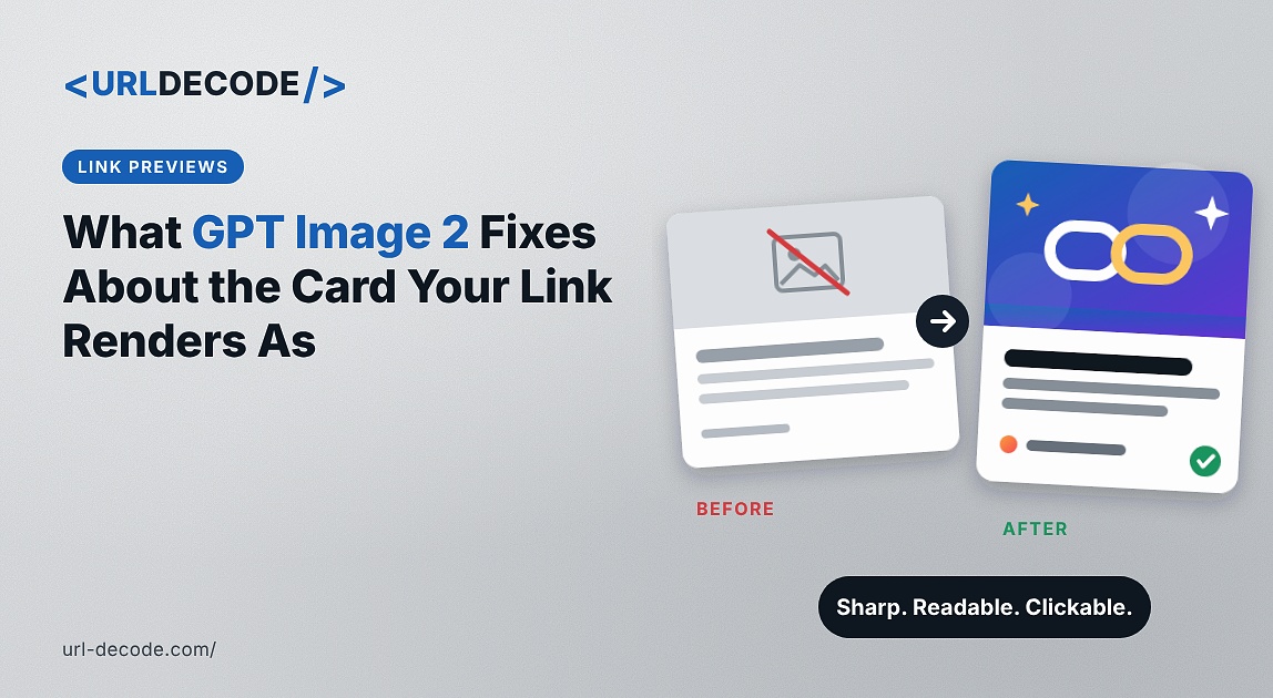
Somebody pastes a link to your site into a chat, and it renders as a grey rectangle with a URL in it.
Or it renders with the same image every other page on your site uses, which at least proves somebody set an og:image once, probably during the initial build, probably the logo.
Or it renders with whatever the platform scraped eighteen months ago, because you changed it and the change never appeared and you assumed it had worked.
All three are extremely common, and all three happen on sites where everything else was done carefully. The social card sits in a meta tag that gets set once and then never enters anybody's field of view again, because the developer who set it doesn't see it and the people who see it aren't developers.
GPT Image 2 for accurate card-creation workflows through Higgsfield handles the part that was actually blocking this, which is producing cards with legible text without opening design software.
What happens when a link gets shared?
A scraper fetches the page, reads the Open Graph tags, and builds a preview from whatever it finds.
The relevant tags are og:title, og:description and og:image, with twitter:image and twitter:card as a parallel set that some platforms prefer and others ignore in favor of the Open Graph ones.
If og:image is present and valid, the platform fetches it, caches it, and renders the card. If it isn't, behaviour varies. Some platforms pick the largest image on the page. Some show nothing but the domain. Some show a blank rectangle.
None of those outcomes is under your control once the link leaves your site, which is the thing worth absorbing. You don't get to explain the card. It arrives in somebody's feed, alongside other links, and it either earns the click or doesn't.
For a utility or content site where traffic arrives through sharing as much as search, that's a meaningful share of the acquisition path sitting in a tag nobody has looked at.
Why does one image cover the whole site?
Because setting a global default is one line and setting per-page images is a system.
Most frameworks and content systems let you define a fallback og:image in a layout or a config file. That covers every page, it takes five minutes, and it's genuinely the right first move.
Then nobody revisits it. The site grows from twelve pages to four hundred, the content diversifies, and every single one of those pages still unfurls as the logo.
The cost is invisible because the developer never sees it. You don't share your own links in your own feeds, so the only people encountering the card are the ones deciding whether to click, and they don't tell you.
Producing per-page images was historically the blocker rather than wiring them up. Wiring is trivial. Making four hundred images was not.
What does the card need to show?
Less than people put in, and it needs to survive being small.
The card renders at a modest size in most feeds and smaller again in messaging apps. Anything subtle disappears. Anything long doesn't get read.
What works is the page title, set large enough in GPT Image 2 to read at that size, with enough contrast to survive whatever background sits behind it.
Some indication of what the site is, which can be a logo mark or just consistent styling that makes your cards recognisable across different pages.
And enough visual difference between pages that somebody who has seen two of your links knows they came from the same place without the two cards being identical.
What doesn't work is a dense screenshot, a paragraph of text, or anything requiring the viewer to lean in.
Where does GPT Image 2 fit?
Producing them, which is the part that stopped this from being done properly.
The specific GPT Image 2 capability is text rendering. A social card is mostly typography, and until recently image models produced text as texture rather than as language, which made them useless for exactly this job.
GPT Image 2 renders text reliably and holds a layout together, so a card carrying a page title, a subtitle, and a mark comes out legible rather than approximate.
GPT Image 2 also resolves layout before generating, so instructions about position hold. Title upper left, mark lower right, stated once and applied consistently.
For a site with categories, that means producing a GPT Image 2 set per category rather than per page, which is a considerably more realistic target. A tools site might need eight or ten rather than four hundred.
Higgsfield runs as an AI creative suite, so generating a set and exporting at the right dimensions happens in one place rather than across a design tool and an export step.
Why doesn't the new image appear?
Caching, and this catches almost everybody at least once.
Platforms cache the unfurl aggressively. Once a URL has been scraped, the card is stored, and sharing the same link again serves the cached version rather than refetching your page. That cache can persist for a long time.
So you update the og:image, you paste the link to check, and you see the old card. The natural conclusion is that something is broken. Nothing is broken; the platform is showing you what it already has.
The fix is to force a re-scrape using the platform's own tooling. The major platforms each provide a debugger or inspector that fetches the page again and refreshes the cache, and they'll also tell you what tags they actually found, which is useful for the other category of problem.
Doing that on each platform you care about is the last step of changing an og:image, and skipping it is why so many sites are serving a card they think they replaced.
What are the technical constraints?
Four, and three of them cause silent failures.
The URL must be absolute. A relative path in og:image fails on every platform, and because it fails silently, the page looks fine, and the card doesn't render. This is the single most common implementation bug in this area.
The image must be publicly accessible. Anything behind authentication, on a staging domain, or blocked by robots rules will not be fetched by a scraper, and again you get no error.
File size matters. Platforms impose limits, and an oversized image is dropped rather than resized.
And the aspect ratio should match what the platforms expect for a large card, which is roughly twice as wide as tall. Something closer to square renders as a small thumbnail beside the text instead of a full-width card, which is a different and weaker treatment.
Supplying og:image:alt is also worth doing, both for accessibility and because some platforms surface it.
Should every page have its own?
No, and the useful unit is the category rather than the page.
A per-page card is correct for a small number of high-value pages. A homepage, a pricing page, flagship content, anything you actively promote.
For everything else, a card per section is enough. All the color converters share one, all the string utilities share another, all the blog posts share a third with the post title rendered on it.
That gets you most of the benefit for a fraction of the production, and it has a secondary advantage. Cards that cluster by section make your links recognizable as a family rather than as four hundred individual designs.
The exception is blog or article content, where the title genuinely should appear on the card, because that's what somebody is deciding from. That's the case for dynamic generation.
What does this change for a tools site specifically?
Worth separating, because utility sites have a sharing pattern most content sites don't.
A tool page gets shared differently from an article. Somebody solves a problem, finds the tool useful, and pastes the link into a team chat or a forum thread with a line saying this does the thing.
That share is a recommendation rather than a promotion, which means it converts considerably better than anything you could post yourself. It's also entirely out of your hands, and the card is the only part of it you control.
A card that names the specific tool rather than the site is doing real work there. Somebody reading a thread sees a card saying what the thing is, rather than a logo that tells them nothing about why it was linked.
For a site with many tools, that argues for cards at tool-category level rather than site level. Color converters, string utilities, DNS tools. Each gets a card naming what that group does, produced once in GPT Image 2 and applied across the pages within it.
Higgsfield storing the treatment means adding a new tool category next quarter is one more card in the same style rather than a fresh decision.
The measurement is awkward, since you can't easily attribute a chat share. What you can watch is referral traffic from messaging and forum sources before and after, which moves slowly and does move.
What about generating them dynamically?
A reasonable approach, and it's worth knowing the trade-offs.
Several frameworks now support generating an image at request or build time, typically by rendering a template with the page title into it. That scales perfectly, needs no manual production, and handles a thousand pages as easily as ten.
What you get is correct rather than designed. A title on a background, consistently, which is better than nothing and better than one logo everywhere.
The hybrid works best for most sites. Produce designed cards in GPT Image 2 for the sections and the important pages, and use dynamic generation for the long tail where volume makes manual production impractical.
The template for the dynamic version can also come from the same Higgsfield direction, so the generated ones look like they belong with the produced ones rather than announcing which is which.
What shouldn't go in the image?
A few things, and one of them is an accessibility point rather than a design one.
Never put information that exists only in the GPT Image 2 card. The card is not read by assistive technology beyond the alt text, and anything essential should be on the page and in the og:description as well.
Never misrepresent the page. A card promising something the page doesn't deliver generates a click and a bounce, which is worse than no click.
Never include a GPT Image 2 screenshot of software that isn't the actual software, for the same reasons that apply anywhere else.
Never use a photograph of a person who hasn't agreed to appear, and don't generate one.
And avoid dense detail generally. The card is small, it's in a feed, and everything subtle is wasted.
What would one site take?
An afternoon for a site with sections, less if the direction already exists.
Audit what you've actually got. Paste three or four of your own URLs into a platform debugger and see what renders, which is frequently a surprise.
Check for the absolute URL problem first, since it's the most common cause of nothing appearing.
Settle a visual direction in Higgsfield. Palette, type treatment, where the mark sits. One decision, five minutes.
Produce a card per section in GPT Image 2, with the section name rendered legibly at the correct proportions.
Export from Higgsfield and wire them up, per section rather than per page.
Then force a re-scrape on each platform you care about, because otherwise you'll be looking at the old cards and concluding none of this worked
Wrapping Up
The social card is the only part of a site that renders somewhere the developer never looks, which is why so many well-built sites unfurl as a logo or as nothing at all.
GPT Image 2 produces the cards because a card is mostly type, and text rendering was the thing standing in the way, and Higgsfield keeping the direction stored means the section you add next year matches the ones you make today.
Then force the re-scrape. Half the people who fix this never see the fix, conclude it didn't work, and go back to the logo.